When it comes to mobile apps, user reviews play a central role. They are not only direct feedback from users, but often also the first impression that potential users get in the app store. A poor rating can be a deterrent and cost valuable users – even if the app is technically sound. However, poor ratings are not always a sign of poor implementation. Rather, they often reflect that user expectations have not been met or that feedback has simply not been collected. In this article, we report on how we successfully improved the rating of the bike to work app after eight years of operation through a thorough redesign. The commission came from bike to work, with the aim of optimizing the user experience and making the app even more user-friendly. We show how technical and UX optimizations as well as a strategic approach to collecting feedback together led to a positive result.
Eight years old, but not a bit tired?
The digital world is developing at breakneck speed. What was state of the art 10 years ago may already seem outdated today. After eight years of successful use, the app has had its day. The biggest challenges of the previous version were as follows:
- Outdated technology: The web app was based on Meteor, an innovative platform at the time, but it was increasingly showing problems with scalability and performance.
- Poor UX: The user interface looked old-fashioned and no longer met the expectations of today’s users.
- Performance problems: Particularly during peak loads, such as at the start of the Bike-to-Work Challenge, there were outages and long loading times.
- Negative feedback: Users complained about bugs, long loading times and an overall not very appealing user experience.
A new start with a wow effect
To solve these challenges, we decided to develop the app from scratch. The aim was not only to eliminate the technical weaknesses, but also to improve the overall user experience and ensure positive user feedback in the long term.
1. UX that inspires
A modern, user-friendly design was a central component of the renewal. The focus was on:
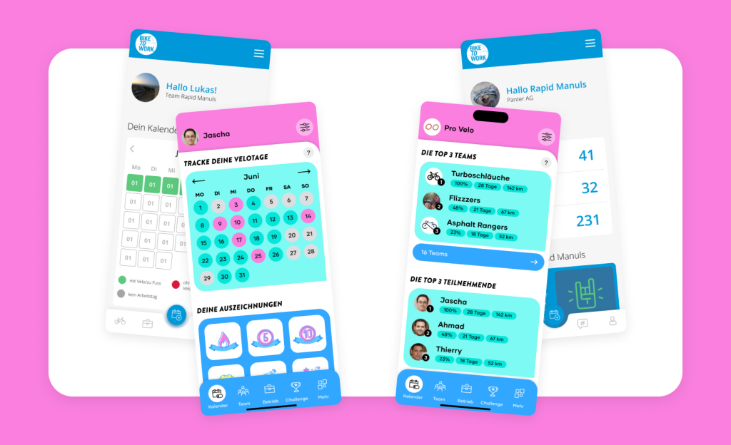
- Design and visual creativity: An expressive and independent visual design in the “Candycore” style now ensures a concise recognition and differentiation feature.
- Aesthetically attractive user interface: Consistently color-coded content in context ensures clarity, efficient usability and fun when using the app.
- Consistent design language: The consistent and harmonious use of visual elements ensures a holistic, identity-creating and user-friendly appearance.
2. technology that convinces
The new app was developed as a native iOS and Android app with React Native. This enabled us to:
- Decoupling from the website: The old web app was closely linked to the website, which could lead to problems with high user loads. With React Native, we were able to provide an independent and stable app.
- Scalable backend solution: We have replaced the Meteor backend with a GraphQL API. This makes it possible to query data in a targeted manner instead of constantly synchronizing it via websockets. This significantly reduces the server load and improves speed.
- Better performance: Thanks to the new architecture, load peaks can also be handled without any problems, which is particularly important during the Challenge.
3. obtain feedback strategically
One of the biggest problems with the old app was the negative feedback from users, which manifested itself in poor ratings. To change this, bike to work commissioned us to implement a review window and strategically approach feedback collection as follows:
- Timing is everything: Instead of asking users for a rating immediately, the system pop-up only appears after a sense of achievement – for example, after reaching an achievement. This way, users give their rating when they are in a positive mood.
- Use system popup: Both iOS and Android offer native popups for requesting reviews. These are easy to implement and appear less intrusive.
- Targeted approach of satisfied, active users: The hurdle to submitting a (positive) review is thus lower and users are spared the detour via the app store.
Successful relaunch
Excellent ratings, satisfied users and a smooth launch – these are some of the most important results:
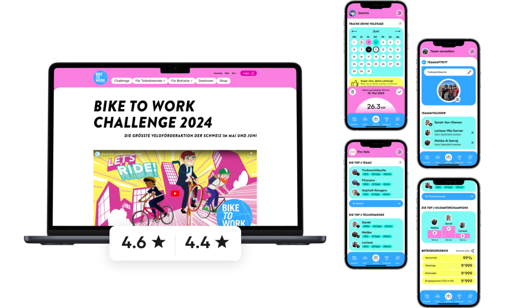
- Significantly better ratings: The app has now received 4.4 out of 5 stars in the Google Play Store with over 600 reviews and 4.6 out of 5 stars in the App Store with 3,800 reviews.
- More satisfied users: Thanks to the more stable and faster app, the number of complaints fell significantly.
- Successful rollout: Despite a high number of users during the bike-to-work challenge, the new app was stable and performed well.
Learning from bike to work: recipes for success for your app
The best strategies for modern design, stable technology and smarter feedback management. Our most important findings at a glance:
- User-centered design: UX is not just a “nice-to-have”, but a decisive factor for the success of an app. Users must be able to navigate intuitively through the app.
- Technological basis: Outdated technology can impair the entire user experience. Switching to modern frameworks and APIs is often the first step towards improvement.
- Obtain targeted feedback: Actively ask users for feedback – but at the right time.
- Learning from feedback: Negative reviews are not a defeat, but an opportunity to recognize and correct the app’s weaknesses.
Conclusion: Success can be planned!
The relaunch of the app shows how a combination of technological modernization, UX optimization and targeted feedback can lead to impressive results. The app is now not only more stable and faster, but also offers users a significantly better user experience. This is reflected in the ratings and ensures the app’s long-term success.
If you have similar challenges with your app, don’t hesitate to contact us. A strategic approach can work wonders.